


For 366 days, we collected COVID-19 testing and outcomes data for 56 US states and territories, including the District of Columbia. Every day, a rotating team of about 15 volunteers compiled data from over 100 state pages, dashboards, and social media accounts into our data entry spreadsheet, producing the complex dataset which we published daily.
For the last nine months of data collection, we collected data during a single “publish shift” (known as “pub shift”) each day. Here’s how it worked.
Data entry team organization
Data Entry was The COVID Tracking Project’s largest team, with 377 people in our #data-entry Slack channel. Some of those people also worked on other parts of the project, but most volunteers initially started out doing data entry.
There were three main roles on the Data Entry team: checker, double-checker, and shift lead.
Every volunteer started out as a checker. Checkers were responsible for “checking” or entering data for states, and flagging any abnormalities they noticed. Checkers generally checked between five and 10 states per pub shift.
Once a checker had completed at least 10 pub shifts and had demonstrated an understanding of our processes, that person was eligible to be promoted to double-checker. In addition to checking states, double-checkers verified that the numbers entered during a state’s initial check were correct, and made sure any errors were flagged and corrected. Double-checkers also helped lead shifts and answer questions.
Once a double-checker had completed 15 shifts in that role, they were considered for a promotion to shift lead. Shift leads were experienced volunteers responsible for overseeing all volunteers on shift and making final decisions about any data abnormalities.
Each pub shift had a primary and secondary shift lead, two to five double-checkers, and four to eight checkers.
The team’s central spreadsheet
We entered data on a Google sheet which we usually referred to as “Worksheet 2,” the name of the tab into which we entered data.1

Each state had its own row, and all of the data sources for that particular state were linked in the first columns on the left-hand side. A program called URL-watch monitored these data sources for changes and displayed a flag if there were any.2
There were 36 columns for data points we collected, including some metadata. We didn’t capture all of these for each state, but due to the complexity of data definitions, we often needed more than one column for similar metrics. For example, for PCR tests, we had separate columns for total PCR tests (specimens), total PCR tests (test encounters), and total PCR tests (people). Read more about how we sourced our data here.
Every cell containing a data point we captured had a source note with detailed instructions on how to find and collect that data point. These source notes guided volunteers and helped ensure that we were capturing exactly the same metric every day.3
One of the logistical challenges we encountered when entering data was that different states updated their data at different points throughout the day, sometimes during pub shifts. To mitigate this, we sorted states into five tiers based on what time of day they updated.4 The shift leads were responsible for changing the tiers throughout the shift. A tier’s available states were displayed in the upper corner of Worksheet 2, so it was easy for checkers to see which states were left to check.
How shifts worked
Each day at 3:30pm Eastern, the primary shift lead for the day would start a sign-in thread on Slack, asking the checkers and double-checkers who had volunteered for that day’s shift to check in with their initials and to answer a lighthearted icebreaker question. The shift leads would take attendance and message any no-shows or late arrivals to get an accurate picture of who would be working that shift.
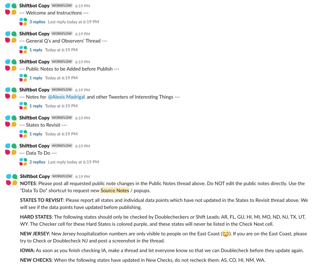
The primary shift lead would then trigger the “Shiftbot” Slack workflow, which would start a series of threads that we used throughout the shift to stay organized.5 A team of data entry shift leads maintained Shiftbot, and the workflow sometimes had special messages that were specific to the day or week, such as a message about being aware of an upcoming holiday.
Entering data
After volunteers had signed in and read through Shiftbot, the data entry began. Checkers claimed states in the first tier and began manually entering each of their data points. Surprisingly, the actual entering of the data was one of the simplest parts of data entry—it was the analysis and discussion of how to handle abnormalities that was most time consuming.
When we had questions about the data entry process or spotted anything noteworthy in the data, we started a Slack thread for the state to let others know. It was important to discuss questions and anomalies as a team and to leave a record of our conversation.
The number of threads we made in a shift varied, but it was almost always more than 10 and sometimes as many as 30. The content ranged from simple yes or no questions about our process to significant data issues that would require a full-blown investigation from our Data Quality team. Data Quality looked closely at all of the data and data definitions provided by states to ensure that we were capturing as much data as possible in a responsible manner.
The abnormalities we encountered changed throughout our year of data entry, but there were a few common types of situations we encountered:
A state posted a note about their data on their dashboards, state pages, or social media.
The majority of a states’ data points had updated, but one or more metrics that we were expecting to update had not.
All of a state’s data points had updated, but one of their cumulative numbers had decreased.
Something on a state site had changed, and we needed to adjust something about our process or data collection method accordingly.
Our response to different data anomalies and changes depended on the situation. We had general guidelines and principles that we followed, but given that the state of COVID-19 data in the US was constantly evolving, it was beneficial to allow our shift leads to have flexibility when making decisions.
If an abnormality had a direct effect on our data, or was something that we felt was important for viewers of our data to think about when looking at the data, we would write a public note about it. Public notes can be found on each state's data page.
For abnormalities that didn’t affect our data but potentially could in the future, we would make an internal note, usually in our shift summaries.6 This allowed us to keep an eye on upcoming changes to the data, even though different people were leading pub shifts on different days.
When we needed to adjust our process or investigate something off-shift, we would file a “data to-do.” These sent a message to a dedicated Slack channel with the state, affected metrics, and issue needing investigation so our Data Quality team could look into it.
One of our principles included not making major process changes during pub shifts. It became clear to us early on that Data Quality and Data Entry needed to be separate teams, but closely related. During pub shifts, it was helpful to be hyper-focused on entering data, and we couldn’t give Data Quality investigations the full attention they deserved. Allowing ourselves time off-shift to work on improving our processes and investigating quirks in the data made our data more accurate and let us “double-check” our decisions.
Finalizing and publishing the data
After we had checked and double-checked data for most states, and were just waiting on a few lingering states, we would let checkers who had other commitments go. Shift leads and double-checkers stuck around to check the last states and publish the data.
When every state was accounted for and had been checked and double-checked, we took one last look at our data to scan for any mistakes or abnormalities in a quality control process called “new checks.”7
Throughout the shift, one or two veteran data entry shift leads kept an eye on the data and scanned for any obvious mistakes or outliers.
After all of the data was entered, all of the shift leads and double-checkers took a final look at the data, and triple-checked any numbers that looked suspicious, or metrics with especially large percentage increases or decreases. The primary shift lead was responsible for giving the data the final seal of approval and publishing it.
After the data had been published to our database and was on its way to our website, the secondary shift lead would post the shift summary for the day, which included any partial or missed updates, and any data abnormalities. The shift summaries kept track of what was going on and helped the next day’s shift leads prepare.
The primary shift lead then wrote a message thanking each individual who had helped collect the data for the day. Gratitude is one of The COVID Tracking Project’s core values, and these thank you messages helped us create a sense of community and support one another while collecting this data.
What we learned after a year of data collection
Consistency in data sourcing is key. It’s important to source data from the same place each day whenever possible.
Manual data entry should be an active task. It’s important to think about the numbers that you’re entering and make sure that they seem reasonable based on previous figures for the metric. If they don’t, getting a second opinion is always valuable.
If there is a data abnormality, make a note of it. COVID-19 data needs context, and providing that is as important as providing the data. We scoured state social media sites and dashboards to understand this data.
Whenever possible, have someone else double-check your work. No person is perfect, and mistakes, typos, and misunderstandings happen. Having a double-check system in place helps to ensure that data is accurate.
Collecting this data is tough and emotionally draining. Building a strong community was key for our successful data collection.
1 Rebma, Elliot Klug, JD Maresco, and Michal Mart helped create and maintain Worksheet 2.
2 Zach Lipton and Jonathan Gilmour maintained our URL-watch. The program was created by Thomas Perl.
3 Brandon Park created our source note syntax. Hannah Hoffman and Jennifer Clyde maintained our source notes.
4 Ryan Scholl created the tier system.
5 Read more about how we used Slack here.
6 Daniel Lin and Quang Nguyen created shift summary system. Daniel Lin created our data to-do system.
7 Rebma created the new checks system.

Hannah Hoffman is a data entry and data quality shift lead at The COVID Tracking Project and a student in the Washington, DC area.
More “Testing Data” posts
How Probable Cases Changed Through the COVID-19 Pandemic
When analyzing COVID-19 data, confirmed case counts are obvious to study. But don’t overlook probable cases—and the varying, evolving ways that states have defined them.
20,000 Hours of Data Entry: Why We Didn’t Automate Our Data Collection
Looking back on a year of collecting COVID-19 data, here’s a summary of the tools we automated to make our data entry smoother and why we ultimately relied on manual data collection.

A Wrap-Up: The Five Major Metrics of COVID-19 Data
As The COVID Tracking Project comes to a close, here’s a summary of how states reported data on the five major COVID-19 metrics we tracked—tests, cases, deaths, hospitalizations, and recoveries—and how reporting complexities shaped the data.

