One of the basic principles behind The COVID Tracking Project has been the reliability and transparency of the data we collect and report. In service to that, we developed a system for taking screenshots of our original data sources, usually state COVID-19 information websites. We did this for a few reasons:
Data provenance: It was important to us to be able to show our work and where the data came from.
Data quality: We needed the ability to go back and check our work against what had been published on specific dates and answer questions like: “What testing and case counts did Massachusetts report on November 19, 2020?”
Maintaining history: There are many situations where we needed to backfill or update data points in response to state data revisions. Capturing and saving old screenshots of state dashboards and sites allowed us to revisit them to trace such revisions.
Data annotations: We needed to be able to keep track of the changes that states would make to data definitions. Being able to refer back to the visual archive of a state website (as opposed to, say, a CSV) greatly increased our chances of preserving the kind of context that often appeared solely in notes or annotations on websites and dashboards.
Archival: Eventually, we want to be able to present a record of what was reported and when, and have that record be as complete as possible.
These requirements made website screenshots important to our goal to have the most complete, accurate, and trusted data set available. We considered existing resources for this, like the Wayback Machine, but did not find any that captured data as frequently or thoroughly as we needed to. So we created our own.
How it started vs. how it’s going
When we first built a screenshot system, it was a quick and scrappy set of Python scripts. We assumed that all we would need to do is capture a basic screengrab of a website: take a URL, render it using an existing resource like PhantomJSCloud, and save it as a PNG image. Things quickly grew more complex, and we had early hints of the need to customize our methods. Some examples:
In the early days, a frequent issue that cropped up (pun intended) was resizing certain sites: some screenshots would be cut off in the middle of the webpage, and the data we needed to screenshot happened to be at the bottom.
Some state sites had a pop-up box with different messages, like offering an email sign-up. With automated screenshotting, pop-up boxes often blocked data or grayed out the rest of the website.
As state websites moved more and more toward Power BI or Tableau dashboards, we increasingly ran into complex situations, such as waiting 60 seconds for a website to load, navigating to tab 13, and hovering over a certain element to display a data point.
Before we had a sense of how frequent and complex our customizations would need to be, we wrote in special cases for particular states directly into the code―like resizing a render view before capturing the screenshot. However, as more and more states required custom treatment, we realized we needed a more general solution for writing custom Javascript to navigate various situations.
Screenshot system details
We collect screenshots for several of our datasets:
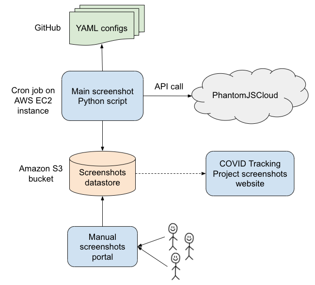
Screenshots were collected by a Python script which ran as a cron job several times a day. The script used PhantomJSCloud to render a specific set of URLs and execute custom Javascript code when necessary. The screenshots were then timestamped and stored on Amazon S3. We made them accessible through the detailed view on each state page as well as on our screenshots website. Here is an overview of our screenshots infrastructure:

All of the screenshot system code is available on GitHub.
Configuration
Each state's screenshot configuration is stored in a YAML file, which contains one or more URLs with entries that look like this:
- name: tertiary
  url: https://adem.maps.arcgis.com/apps/...
  overseerScript: |
    page.manualWait();
    await page.waitForSelector("span.ember-view.tab-title:nth-of-type(5)");
    page.click("span.ember-view.tab-title:nth-of-type(5)");
    await page.waitForDelay(10000);
    page.done();
  renderSettings:
    clipRectangle:
      height: 1400
      width: 1400
  message: clicking on "Tests" tab for AR tertiary
The "name" is a descriptive name for this particular link; for better or for worse, we settled on naming our screenshots primary/secondary/tertiary early in the project. Primary screenshots generally captured states’ main data sources, while additional screenshots captured data that required unique scripting. We then used PhantomJSCloud to render the given URL, and before taking a snapshot, we directed PhantomJSCloud to run the script specified in overseerScript. In this case, we clicked on a particular tab within the dashboard, waited 10 seconds for the page to load, then took the snapshot.
We also modified the rendering settings for this page to be able to capture all of the relevant data. For more context on clipRectangle and other possible settings, check out the PhantomJSCloud documentation. Lastly, we included a "message" for documentation purposes, to understand our special case behavior for that state.
We also built in a workaround to download data files directly rather than capture a screenshot. See an example config file.
All of our config files backing screenshots can be found on GitHub in the Screenshots repository: testing and outcomes data configs, COVID Racial Data Tracker configs, and Long-Term-Care COVID Tracker configs.
Manual screenshots
As we built out our data point coverage, we encountered various cases that were difficult to capture with the screenshot script.
The most common such case was Microsoft Power BI or Tableau dashboards that would load so slowly that we could not capture them even after instructing the script to wait several minutes. This problem was worse when states embedded these dashboards in their sites and did not enable the option for users to view them separately.
Another difficult case―and a nightmare for web accessibility―was when sites required visitors to click on or hover over buttons or chart objects to see the data. In some cases, we were able to direct the script to click on or hover over the object if it could be specified using DOM scripting or CSS selectors or if it remained stationary day-over-day and we could direct the script to the x,y coordinate point on the page.
A final example: when data points were published in reports with unpredictable names that could not be navigated to from the state websites. Predictable names might consist of a filename slug with the date the file was posted appended to it; an unpredictable name might include case or testing numbers in the URL. We managed to find workarounds and hacky tricks that allowed us to capture some data points that fell into all of these cases. Too often, though, we could not script these screenshots.
In the fall, to address cases in which we could not capture automatic screenshots, we began to take manual screenshots and post them in state-specific Slack threads during data entry shifts. After a few weeks, we decided to roll out a system for manual screenshots to augment our coverage and save our volunteers the task of spending hours―sometimes fruitlessly―to configure single screenshots for the most difficult data points. We spun up a system that would allow us to upload screenshots manually through our internal website and store them in Amazon S3, along with various scripts and bots that helped us track and validate these manual screenshots.

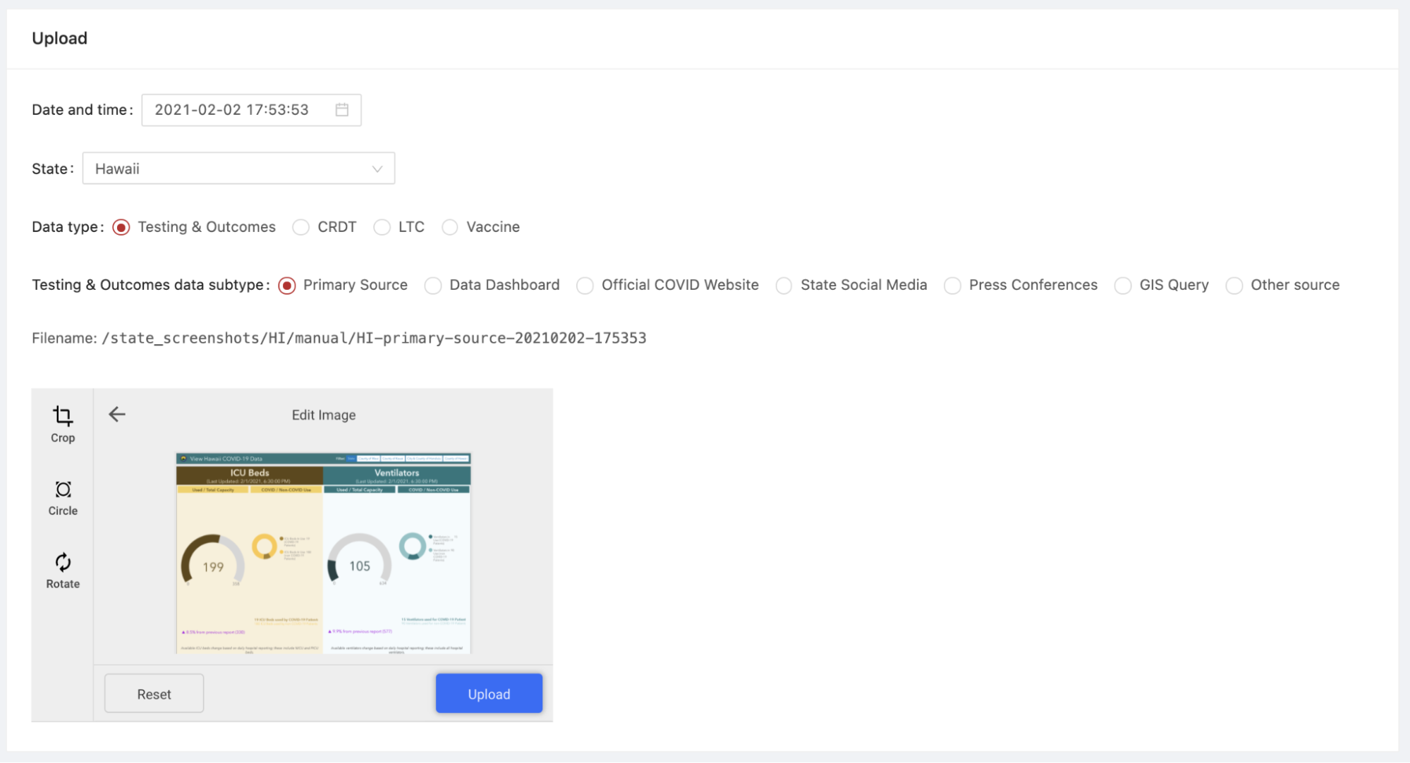
This portal allowed users to configure date and time, state, data type, and data subtype with buttons and dropdowns that automatically set the screenshot filename. In this example, the data type is “Testing & Outcomes” data (our core data entry) and the data subtype is “primary source,” denoting that this screenshot was taken of the page or dashboard that was our primary source for the state of Hawaii. Once users clicked Upload, the screenshot would be stored in the Amazon S3 bucket for the state and a bot would post to a thread in our data entry channel that the screenshot had been uploaded.
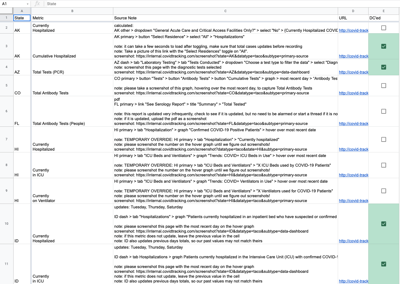
At the height of the manual screenshot system, we captured 25 manual screenshots each day during core data entry. Different volunteers could submit screenshots for each state, so we kept processes simple. Volunteers knew which screenshots to capture by referring to source notes, pop-up notes on our data entry sheet that informed volunteers where to find metrics. An example source note with screenshot instructions is below:
HI primary > tab "ICU Beds and Ventilators" > graph "Trends: COVID+ ICU Beds in Use" > hover over most recent date
note: please screenshot the number on the hover graph until we figure out screenshots!
screenshot: https://internal.covidtracking.com/screenshot?state=HI&datatype=taco&subtype=primary-source
The link in the source note would take the volunteer to the internal website page with the appropriate options preselected with the URL parameters. The volunteer would simply need to capture the screenshot, navigate to the link in the source notes, select the correct file on their computer, and hit Upload. The page would autofill the date and time when the volunteer visited it, though the option remained to select date and time in order to allow for historical screenshots to be uploaded.
To ensure that all manual screenshots correctly captured the right metrics, one designated volunteer would double-check all the screenshots. We built a script that would find all instances of screenshot source notes in our data entry source notes sheet and would write them to a manual screenshot checking sheet, allowing the double-checker to check off when each screenshot had been uploaded and validated during the shift. In tandem with the Slack bot that notified when each screenshot was uploaded, this screenshot checking sheet made verifying manual screenshots a breeze.

Human maintenance
Keeping screenshots functional and up-to-date was a tedious and time-consuming task. States frequently changed dashboards and data pages, added new metrics, or removed metrics. Sometimes the data entry team switched sources around within state sites based on the recommendation of our data quality team. Screenshots occasionally broke and needed maintenance. To accommodate these changes, we devised processes to ensure that our screenshots worked and were up-to-date.
Once a week, a small team would meet to check screenshots using a tracker sheet that mirrored our source notes for each data point. For all 56 states and territories that we tracked, volunteers would select screenshot status for each data point. Volunteers could choose from a number of dropdown options to record whether the data point was captured in a screenshot, and if so, in which one. Among the options were “primary” through “quinary” to indicate which screenshot contained the data point (owing to our decision to name script-captured screenshots sequentially), N/A Manual Screenshot, and various other options to indicate coverage or the fact that we did not need to worry about coverage.
If volunteers found a data point that was not covered by our screenshots or encountered a broken screenshot, they would submit a “To Do” ticket using a Slack workflow and list the state, the data point to be captured, and a description of the problem. Screenshot maintainers worked mostly asynchronously and tackled these to-dos as they popped up.
On March 6, the day before we ended data collection, we reached 100% coverage of our 797 core testing and outcomes data points. Reaching that milestone required hundreds of scripted screenshots, dozens of manual screenshots, and huge amounts of volunteers’ time.
Takeaways
We learned a lot in both building and evolving a system to capture images of state COVID-19 data websites. This project was a half-structured-data capture: we aimed to preserve a human view of the state COVID-19 data, though to get at the relevant human-viewable website section, we often needed to structure how we arrived there. While in some cases we used the screenshot system to download data files, the goal remained to capture snapshots of the data that people could scan visually.
Absent more concrete federal guidelines for data reporting, the COVID-19 data landscape was a patchwork of idiosyncratic state data pages and dashboards. Many states published data on sites with severe accessibility issues. Some states published metrics across many pages and dashboards, while others constrained them to a single site. Tableau and Microsoft Power BI were widely used; we had to reverse-engineer these dashboards to get at the data we needed, accidentally developing a brain trust of dashboard-scripting manipulations. To capture screenshots of our data sources required flexibility, tenacity, and a team of committed contributors ready to address any possible issue with states’ reporting.
Ultimately, what we built is a kind of general purpose website screenshots engine. For any future data collection project that relies on maintaining provenance, history, and accuracy of data, we recommend developing or using this kind of system early in the project, since data transparency and accountability only becomes more important over time.
Acknowledgements
Data quality contributors―including Jesse Anderson, Elizabeth Eads, Jonathan Gilmour, Hannah Hoffman, Michal Mart, Theo Michel, Brandon Park, Kayleigh Van Poolen, and more―kept our screenshots fresh by checking them for issues and coverage.
Screenshot maintainers―including Jesse Anderson, Jonathan Gilmour, Hannah Hoffman, Julia Kodysh, Zach Lipton, Michal Mart, Theo Michel, Charlotte Minsky, Kara Schechtman, Andrew Schwartz, and Josh Zarrabi―wrote and maintained our screenshot config files.
Jonathan Gilmour, Hannah Hoffman, Elliott Klug, Michal Mart, and Quang Nguyen built processes and tooling for tracking screenshot quality.
Kevin Miller spun up internal and external screenshots websites and built the manual screenshot slackbot affectionately known as Manual Screenbot.
Julia Kodysh built the screenshots system and infrastructure.

Julia Kodysh is Data Infrastructure co-lead at The COVID Tracking Project.

Jonathan Gilmour is a Data Infrastructure engineer and Data Quality contributor at The COVID Tracking Project.
More “How We Made The COVID Tracking Project” posts
20,000 Hours of Data Entry: Why We Didn’t Automate Our Data Collection
Looking back on a year of collecting COVID-19 data, here’s a summary of the tools we automated to make our data entry smoother and why we ultimately relied on manual data collection.

Dating Data: How We Used Multiple Dating Schemes to Provide the Most Complete Picture of the Pandemic
Throughout our year of tracking COVID-19 tests, cases, and outcomes, we were confronted with data organized by numerous dating schemes. Here’s how we came to understand those dating schemes, and the solution we developed for making the best of them.


Behind The COVID Tracking Project’s Public Help Desk
Volunteers and staffers at The COVID Tracking Project replied to thousands of messages from the public last year. Here’s why we took the trouble, and here’s what people wanted to know.

