


In an ideal world, we would know exactly how many COVID-19 infections there are in the United States at a given time—a measurement known as disease prevalence, which is usually portrayed as a percentage of the population.
Although it’s hard to measure COVID-19 prevalence, we can look at the number of “confirmed cases,” a figure that corresponds to the number of viral diagnostic tests that come back positive. By dividing this number by the total number of reported tests and multiplying the result by 100, we get a test positivity rate, also known as percent positivity. US states and territories report tests using several different units, so it’s important to use the same unit in the numerator (positive tests) and denominator (total tests) of this equation.

Test positivity is a confusing statistic because it’s affected by two factors: viral prevalence and testing strategy. When analyzing test positivity, it’s important to look at the full picture to figure out which one of these factors is driving the change in the number.

Comparing States or Regions
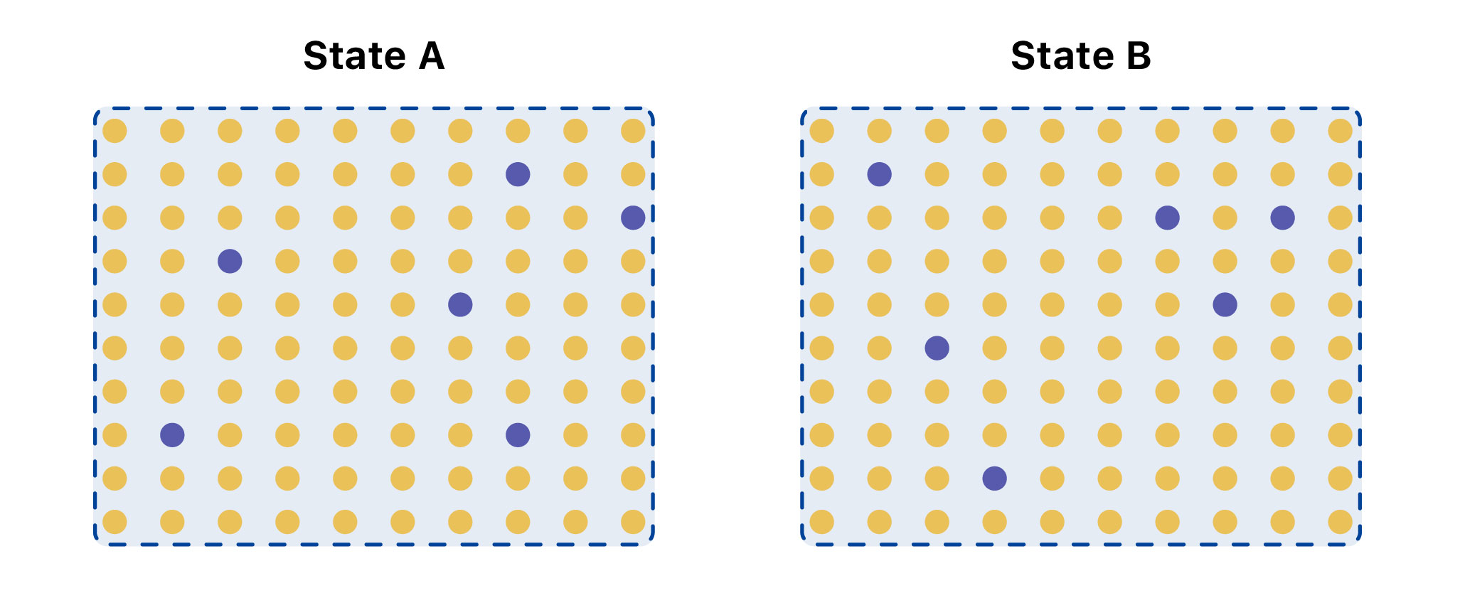
In this extreme example, State A has over three times as many infections as State B, even though both have 6 percent of tests coming back positive. This could be explained by differences in testing strategy—who is getting tested.
Recent college reopenings provide a concrete example of why it’s important to understand the limitations of test positivity. At the University of Notre Dame, a local news source accurately reports, test positivity is “fewer than half a percent” when the fall semester started and 12,000 people were tested. However, the publication also states that, a few days later, “15 new infections out of only 30 tests” were found, which represented a “50 percent positive rate.”
Although there is technically nothing wrong with this calculation, it is misleading to imply that the test positivity changed from <1 percent to 50 percent. The original sample had the purpose of testing everybody, regardless of their symptoms, upon their arrival to campus, with thousands of tests performed. In contrast, only 30 tests were performed in the second dataset. It’s also unclear if the 30 tests performed were on individuals with symptoms or if these individuals had recent contacts of the virus. Even if calculated correctly, the test positivity numbers are misleading when compared to one another, since two very different sets of people were tested in each situation.
While this is an extreme example, it’s important to understand the limitations of the test positivity metric—and to be precise about why the percentage is changing. Increases in test positivity are concerning for different reasons. It could be because different people are being tested, and more tests should be performed to find all of the missing cases and have a better handle on the outbreak. Or it could be because there is an actual rise in cases. Declines in test positivity could mean the virus is waning, or it could mean the outbreak size is the same and something is changing about who is being tested, where tests are being performed, and how many tests are being utilized.
At The COVID Tracking Project, we strive to provide a transparent national dataset that contextualizes the limitations of our statistics. In the absence of federal data standards, calculating test positivity responsibly requires extreme care with and transparency about testing units and labels. As a reminder to our readers, The COVID Tracking Project does not calculate test positivity rates and will not do so until we are confident in our ability to communicate precisely about these complex issues in our visualizations. We urge caution when relying on any (governmental or non-governmental) test positivity calculation that does not transparently and prominently address the question of inconsistent testing units across jurisdictions. Even if calculated correctly and consistently, it’s critical not to overinterpret what this valuable metric can tell you about the pandemic.

Júlia Ledur is a visual journalist and illustrator who leads the visualization team at The COVID Tracking Project. She is a former graphics reporter at Reuters.

Jessica Malaty Rivera has an MS in Emerging Infectious Diseases and is the Science Communication Lead at The COVID Tracking Project.

Tong Wang is an MD-PhD candidate at the University of Pennsylvania.
More “Testing Data” posts
How Probable Cases Changed Through the COVID-19 Pandemic
When analyzing COVID-19 data, confirmed case counts are obvious to study. But don’t overlook probable cases—and the varying, evolving ways that states have defined them.
20,000 Hours of Data Entry: Why We Didn’t Automate Our Data Collection
Looking back on a year of collecting COVID-19 data, here’s a summary of the tools we automated to make our data entry smoother and why we ultimately relied on manual data collection.

A Wrap-Up: The Five Major Metrics of COVID-19 Data
As The COVID Tracking Project comes to a close, here’s a summary of how states reported data on the five major COVID-19 metrics we tracked—tests, cases, deaths, hospitalizations, and recoveries—and how reporting complexities shaped the data.

