


Over the past year, The COVID Tracking Project answered thousands of messages from the public, and in doing so we learned just how many people were paying close attention to COVID-19 data. Visitors to our website used the contact form to send us over 4,400 messages between May 2020 and April 2021. We got messages from federal and state government officials, media representatives, businesspeople in many industries, and medical and academic researchers, but we also got plenty of questions from people who were tracking COVID-19 data just so they could understand the pandemic.
The people who wrote to us helped us find bugs and ambiguities in the data and the way we presented it that we’d never have found ourselves. Taking the time to investigate and respond to the issues people wrote us about wasn’t just a public service. It was a valuable feedback loop that helped us understand the data better and explain it more clearly in other contexts.
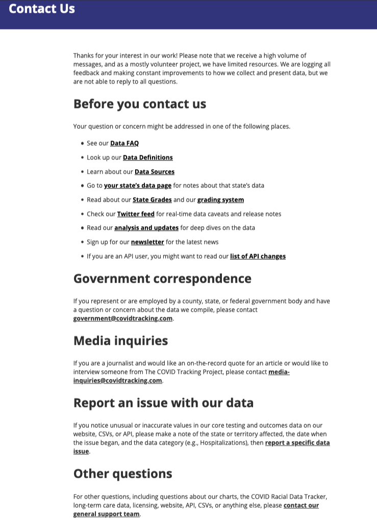
Getting in touch with The COVID Tracking Project
In early May 2020 we launched a basic contact page and form. The page directed visitors to one or two links that they might want to visit instead of or in addition to using the contact form, but it didn’t link to any pages about the data.
This early version of the form asked people to select one of six reasons for writing:
I have questions about the state data grades
I have feedback on the COVID Racial Data Tracker
I'm a journalist with a media question
I want to report an issue with the website or web accessibility
I want to report an issue with your data
Something else!
We received over 500 messages from this version of the contact form in May, nearly 700 in June, and nearly 900 in July, our peak month. Nearly two-thirds of the messages we received in these three months were tagged “I want to report an issue with your data.”
In August, we began providing more information on the contact page, linking to data documentation pages on our website that answered many of the questions people had been asking via the contact form. We removed the form from the page so that visitors would need to take some time to skim the text content and links instead of immediately typing a question. We also introduced some changes designed to sort and channel the messages more precisely. The new version of the page asked members of the media and government officials to write particular email addresses instead of using the generic contact form so that those high-priority messages could go directly to project leaders. The single contact form was split into two forms: one for reporting issues with our daily testing, hospitalization, and outcomes data and one for everything else.
The new form for reporting data issues required the person writing us to name the state(s), date(s), and metric(s) they were concerned about―for instance, Georgia’s hospitalization numbers on August 28. The revised version of the general contact form required people to select one of seven reasons for writing:
Race and ethnicity data
Long-term-care data
Website content or accessibility
Licensing
API or CSV files
Charts
Something else
The number of messages we received each month decreased significantly after these changes, possibly because we added steps to the process―but also, we hope, because we began to encourage people to find answers on our site before they wrote to us. We made major changes to our site in late August 2020 that were explicitly designed to clarify the data, which might also have helped reduce the number of questions. We received about 550 messages in August 2020, nearly 300 in September, and just over 200 in October.
How our process worked
When we first launched the contact form, we imagined that three or four volunteers would be able to read and reply to most incoming messages and that collaborative processes would be relatively simple to set up. What we discovered, however, was that members of the public were such close readers of the data and the data was so complicated that a single issue might take multiple people hours or even days to evaluate and answer correctly.
In the first days of what we came to call the “Help Desk,” we had to come to terms with the reality that people who answered questions needed a thorough grounding in recent data trends, ongoing Data Quality projects, data definitions and anomalies, and The COVID Tracking Project’s data collection processes. Moreover, many questions and issues could only be answered by the leads of particular teams. So instead of creating a separate team to run the Help Desk, our most experienced volunteers and team leads from all parts of the project gave it a little time whenever they could, and a small number of Help Desk regulars tried to review most incoming messages and escalate important ones to the appropriate person.
Questions submitted through the contact form reached us through Front, our help desk software. All messages from the public and ensuing replies could be read by any of the two dozen or so members of The COVID Tracking Project with access to Front, but each incoming message was sent to a particular inbox based on the message category: Data Issues, Charts, Race Data, Long-Term-Care Data, Website, and General. Incoming data issues were also automatically tagged with the state, date, and metric that the user had selected on the form.
In the fall of 2020, we also began taking advantage of a useful feature in Front that copied incoming messages to Slack, where they could be quickly read and discussed (though not answered) in the same place we conducted the rest of our work. In Front, most data issues and general questions were answered by experienced Data Entry volunteers. We also had help from project leadership and volunteers with specialized roles, such as people from our Data Quality and Website teams. If a volunteer could not answer a question, we frequently discussed the issue further in Slack or Front and consulted specialists as needed. Questions requiring modifications of existing data or data definition changes were entered as issues in one of our GitHub repositories for our Data Quality team to research and resolve.
While we had two-hour help desk shifts on weekdays during the day, the work of answering messages also lent itself nicely to asynchronous work; people who wrote in might get a reply at 2:00 a.m. Depending on the nature of the messages we received on a given day, a volunteer could answer up to a dozen messages in one shift or not even manage to finish a single message. Nevertheless, we aimed to be timely with our responses. The average response time was less than a day: 20 hours and 52 minutes, to be exact. We were often able to answer many messages as soon as they came in: around 30% of incoming messages received a reply within two hours.
That said, we couldn’t get to every message right away. Although quite a few volunteers passed through the Help Desk, we had a limited fixed crew, and we often struggled to keep up with the pace of incoming messages. Messages could pile up, and some responses took significantly longer than others, sometimes upwards of a week. Work on the Help Desk was also unpredictable and difficult to train for; we could never anticipate the kinds of messages we would receive. Moreover, even though the Help Desk required a great deal of specialized knowledge, strong writing skills, and deep patience, the work wasn’t the highest priority, and so not many people with the requisite expertise could give it much time. We tried to emphasize to everyone involved―those who wrote in as well as those who replied―that we could not promise to answer or even read all messages. We concentrated instead on using our Help Desk experience to create content that would be useful for many people, such as the autoreply email that everyone who wrote to us received, the message templates that volunteers could use to reply to common questions, and the data documentation pages on our website.
Over the course of the project, we published many pages of explanatory documentation about the data, and we revised and expanded this documentation over time. When we replied to people who wrote to us, we made it a habit to include links to this documentation: our Data Definitions, our Frequently Asked Questions, our API change log, and our public notes about each state’s data (such as Georgia’s). We also sent links to individual GitHub issues, individual screenshots of state coronavirus data dashboards, and individual long-form analyses explaining data problems in depth.
But we didn’t just use our documentation to explain things to people who wrote to us: we also used questions we received to update our documentation. It was always difficult to write documentation and keep it up to date, but eventually we established a kind of virtuous circle. A major change in our methodology that we knew would likely result in many questions from the public would be explained in writing before we made the change, and we’d then use and adapt that piece of writing in the Front application autoreply and response templates as well as public web pages such as our FAQ and API change log. Similarly, when someone pointed out an issue we hadn’t considered before, we often repurposed a reply to that person as public text on our website.
Questions we received about data
People who reported a data issue often told us that they were writing about “US data,” or the national total, not data for a particular state. For example, we received a November 2020 email in which someone objected to the fact that in mid-April we had reported only about 31,000 cases of COVID-19 in the US but nearly 60,000 people hospitalized with COVID-19. We wrote back and explained that the 31,000 figure represented new cases for that day, not the total, cumulative number of cases.
While we received nearly 400 messages about US data, we received more than 2,000 messages about data for a particular state or set of states. According to our tags, the top five states people wrote us about were Florida, Texas, Minnesota, Arizona, and Georgia.
Questions about Florida data varied widely, but one source of frequent confusion was which metrics included only residents of Florida and which metrics included non-residents of Florida: Florida and Alaska were the only states we knew of that made this distinction in their data. In late October 2020, we stopped reporting non-resident figures in Florida case data to better align with test data, and a few days later an eagle-eyed user pointed out that our Florida notes still said that the case data included non-residents. We apologized, thanked them, and made the correction. Another common question concerned differences between our data and a prominent chart in Florida’s daily coronavirus data PDF. We received so many queries about this issue that we made it an example on our FAQ page under the question “Why doesn’t your data match what I see on the official COVID-19 page for my state?” The answer: Florida changed all the historical data in the chart every day as test results from earlier days came in, causing mismatches with our record of what Florida had previously reported. This was a common and perfectly legitimate practice by states, but it wasn’t one we could replicate without internal access to a single centralized data system for all the states. Having to answer such emails helped teach us how to explain the difference between “date of public report” and “date of test result” or “date of specimen collection.”
One example of a knotty data problem concerned the difference in hospitalization and death data for Minnesota and Tennessee. In December 2020, someone wrote in to ask why the daily number of deaths in Minnesota was larger than the daily number of deaths in Tennessee given that the number of current hospitalizations in Minnesota was consistently less than half than the number of current hospitalizations in Tennessee. After investigating to make sure that our data for both metrics for both states was correct, we considered other explanations. Ultimately, we replied that there could be several possible reasons for that oddity, such as a longer lag in death data in Tennessee or the likelihood that in Minnesota a greater number of people with COVID-19 were being cared for in nursing homes instead of in hospitals. We pointed the person to our long-term care facility data for Minnesota and Tennessee, which showed that there were at that time nearly double the number of deaths in Minnesota long-term care facilities as in Tennessee long-term care facilities.
Sometimes a stream of similar messages led us to make significant changes in our practices. In the winter of 2020, during one of the worst surges of the pandemic, we received repeated questions about why national totals for the number of people ever hospitalized, in the ICU, or on a ventilator were less than the national totals for the number of people currently hospitalized, in the ICU, or on a ventilator. Those questions led us to stop reporting national cumulative hospitalization figures on our website. By that point, all states were reliably reporting daily current hospital figures, but many states had never reported the total number of people with COVID-19 who had ever been in the hospital, in the ICU, or on a ventilator, so the national sum of these figures from state data was always incomplete. We had always harbored doubts about whether these partial national cumulative hospital figures were useful, and this flood of protests from our data users was proof that they were not.
Other issues people wrote to us about
The public wanted to talk about more than just the numbers. People often reached out immediately if our data was delayed past our typical publish time, and they were quick to catch any mistakes that had occurred during the data publication process. On one memorable evening, both happened. On August 4, 2020, we accidentally published the data twice, which doubled all the data figures, and the problem then took hours to fix due to a Google outage―during which we received many agitated messages.
We frequently received questions about our charts (How can you report hospitalizations per million in South Dakota when less than a million people live in South Dakota?), website (Why did you redesign your data pages to look like CVS receipts?), and license (Can my hedge fund have permission to use your data in our financial models?). We often received requests to track particular metrics such as cases by age or comorbidities, COVID-19 in schools, and vaccination data. While we would have liked to grant some of these requests, the quality of state-level data reporting often prevented us from doing so, not to mention that our own capacity was limited. We also received inquiries from researchers and students from diverse backgrounds who were using our data in many exciting research projects.
We tried our best to answer even when questions fell outside our scope. We explained many times that we did not do contact tracing―people were apparently often confused by the similarity of “COVID Tracking” and “COVID Tracing.” Likewise, we received and politely declined several requests from commercial organizations for partnership or sponsorship opportunities. A recurring point of clarification we made was that we were a non-governmental and non-commercial operation; more than one person believed we were a government website. We directed many users to state public health agencies for further assistance.
We were surrounded by numbers at The COVID Tracking Project, but the numerous personal stories and questions we received via the contact form continually reminded us of the human toll and emotional impact of the pandemic. People wrote to us to ask where to get a COVID-19 test or to get vaccinated, and they told upsetting stories of losing work or facing eviction. Especially after the launch of our long-term-care facility map, several people told us of parents or grandparents who died in long-term care facilities, and we sent them our heartfelt sympathy.
We also received many impassioned and colorful critiques of our work. While some messages accused us of spreading a pandemic hoax by inflating or exaggerating case and death counts, other messages accused us of under-reporting or subtracting case and death counts in order to downplay the severity of the crisis. Many messages about the COVID Racial Data Tracker said that tracking COVID-19 race and ethnicity data was racist, and many messages denied that COVID-19 was affecting people of color disproportionately or tried to provoke an argument about the causes of racial disparities. As we neared the end of The COVID Tracking Project’s daily data collection earlier this year, we received many kind and generous notes of thanks, but we also received outcries about our decision to stop collecting data: many people felt that our shutdown was political or that we were abandoning an important public service. We tried our best to communicate our reasons for winding down the project, and in the final weeks of data collection, we also made many suggestions for alternative federal data sources.
Data to the people
The Help Desk helped us understand the ways in which our data was used and interpreted, kept us grounded in the social reality of the pandemic, taught us to explain complexities about the data, alerted us to bugs and mistakes we could correct, and reminded us of the importance of the work we were doing. If “Data to the People” was The COVID Tracking Project’s unofficial motto, then listening and responding to the people was a rightful part of that mission.
Thanks to JD Maresco for launching the first version of the contact form and choosing Front for our help desk software, and thanks to Front for donating their terrific product to us. Thanks to GG Rowe for serving as our first official Help Desk volunteer. Thanks also to everyone else who helped on the Help Desk: Alexis Madrigal, Alice Goldfarb, Anna Schmidt, Artis Curiskis, Brandon Park, Daniel Lin, Elizabeth Eads, Erin Kissane, Jessica Malaty Rivera, Kara Oehler, Kara Schechtman, Kevin Miller, Lauran Hazan, Matt Hilliard, Maya Emmons-Bell, Michal Mart, Michael Parks, Neesha Wadhwa, Peter Walker, Quang Nguyen, Rachel Chanderdatt, Rachel Lee, Rebma, Roberta DePoppe, and Theo Michel. Thanks to Kathy Paur for the phrase “Data to the People.”

Amanda French, Community Lead and Data Entry Shift Lead at The COVID Tracking Project, has a doctorate in English and is an expert in digital humanities.

Brian S.-K. Li has been a Data Entry and Data Quality Shift Lead at The COVID Tracking Project since May 2020 and is a student at Princeton University.
Related posts
Inside The COVID Tracking Project's Volunteer Organization
More than 800 volunteers performed thousands of hours of work to make our regular data operation possible during the COVID-19 pandemic.

Measuring Our Impact at The COVID Tracking Project
Our largely volunteer-operated effort became a critical data source for journalists, scientists, academics and government officials.

The Decisions We Made
Looking back at what made The COVID Tracking Project work.
